Thursday, 18 December 2014
Film Review - Progress 2
Lately in my Film Review I have been thinking about the different conventions and implementing them into my own Film Review. Using inspiration from the film review case studies, I have began to include conventions such as the masthead, star rating, page numbers, subscriptions, issue date and other branding to make my film review look more authentic.
Tuesday, 16 December 2014
Film Review - Progress 1
Today, I began to add images to my Film Review. To do this, I have to add the images I wanted to use and import them into Adobe Indesign. I used one image from my photography and two still images from the film. It was not as easy as it seemed however as I had to resize the pictures without making it look stretched - especially the main image. To do this, I cropped it a bit which did help.
For the still images, I wanted to include a Gutter like in the First Case Study I done - Hummingbird. To do this I created a white box and layered it under the still image.
Monday, 15 December 2014
Film Poster Layout
This is the layout we plan to use to make the film poster. It lays out the conventions and placement of everything on the film poster we will make which allows us to have an idea of what it would look like. James will be making the film poster.
Film Review Layout
As I am in charge of doing the Film Review, I have laid out how I want my film review to look in Indesign.
I have mainly used the rectangle tool and this would allow me to add images and measured out my columns using the margin.
I have also labeled each section to remind myself what I will be including in that section.
I have mainly used the rectangle tool and this would allow me to add images and measured out my columns using the margin.
I have also labeled each section to remind myself what I will be including in that section.
Friday, 12 December 2014
Photoshoot - Extra
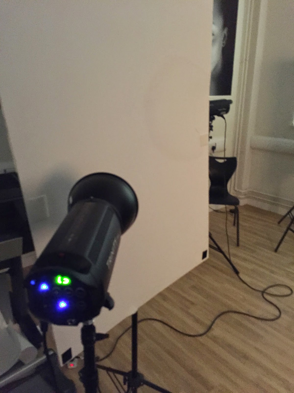
These are some extra pictures I have taken using my iPhone from the Photoshoot. As you can see, a black screen was used. This allowed us to match our colour scheme and allowed us to have a black background on our print products.
The lighting that was used was Trinity Professional Studio Lighting kit which allowed us to have good lighting to contrast from the black screen.
The lighting that was used was Trinity Professional Studio Lighting kit which allowed us to have good lighting to contrast from the black screen.
Thursday, 11 December 2014
Photoshoot Pictures
Here are some of the photographs taken from our photoshoot. We tried to take pictures from different angles and different types of shots in order to have a wide variety of pictures to choose from. Some of the photographs taken from the photoshoot will be displayed here.
Sunday, 7 December 2014
Thursday, 4 December 2014
Team Meeting for Print Production
Today we had a team meeting to discuss the roles for our print production and work related to it.
We decided to book our photoshoot for our film poster on Wednesday 11th December where our actor would come and take pictures for our photoshoot or film review.
We have decided a plan on what our shots would be as we have designed some rough posters:
We also decided roles for making the poster - as we had 3 tasks and 3 people we decided that:
Thomas (me) will do the Film Review using Indesign
James will do the Film Poster using Photoshop
Romana will do the Journalism on Microsoft Word.
We decided to keep on with our colour scheme on white, black and red to represent our film.
Subscribe to:
Comments (Atom)


